An app that makes journaling an accessible, intuitive, and relaxing experience.
Objective: End to end mobile application design
Role: Product Designer, Product Researcher
Timeline: 2 weeks
Tools: Figma, Figjam, Google Meet
Background
Mental health disorders are a health concern that will affect every person in varying degrees, whether directly or indirectly. According to Johns Hopkins, “about 1 in 4 adults suffers from a diagnosable mental disorder in a given year.” Many people will be diagnosed with depression or anxiety at some point in their lives.
Problem
Journaling is a very common and effective form of self care and, In the digital age, many people spend the vast majority of time on a mobile device. However, there are not many apps that are optimized for digital journaling, especially in more ways than just writing words.
Solution
Design a digital journaling app that:
Is optimized for multiple mediums of creative expression, such as photos, videos, and audio. This can be extremely helpful for those who want to journal regularly, but prefer to have other means of journaling that go beyond writing words.
Offers AI-generated prompts that are personalized to the user’s preferences and journaling habits. This will help the user curate a habit of journaling regularly, and remove ideation as a barrier from the journaling process.
Process
Empathize
As a mental health advocate approaching the topic of digital journaling, I had a few ideas that I thought might be great solutions, such as incorporating a mood tracker. But, I needed to conduct research before diving into the design process. What do users want, and what are they currently doing?
Find out how users currently journal digitally, what their needs and expectations are.
Discover user motivations for journaling, and how to make journaling more appealing and accessible for them.
Find out barriers to journaling, and pain points when trying to build a journaling habit.
Study market trends and uncover potential gaps
Goals
Competitive Analysis
User Interviews
Methods
Competitive Analysis
I did some research on direct and indirect competitors, to see what companies are already offering to users, and where there may be some gaps in the market.
There is a lack of mood tracking among common journaling apps - consider the reasons for this (lack of user need vs lack of technology vs privacy concerns? etc.)
Ensure there is a way for users to organize their journal entries
Ensure that the app is available for all smartphone users
Key Takeaways
User Interviews
I conducted virtual user interviews with 5 participants, ages 23-40, to discover user needs, motivations, pain points, and desires when journaling. I wanted to find out how users felt about mood tracking, to see if this was something I should prioritize when building my MVP.
Affinity Mapping
After receiving all the information from my users, I used affinity mapping to pinpoint common themes shared among users, and uncover the problems I can solve.
Key Takeaways
NEEDS
Personalization of their journaling experience
Reminders to help build the habit
Prompts/guidance to help when they are feeling stuck
PAIN POINTS
Feeling distracted when trying to journal
Having a lack of time in their daily life - they are less likely journal if it requires sitting in one place for a long time
Having a hard time getting their thoughts out, or figuring out what to write
DESIRES
A beautiful, simple UI
Easy and intuitive ways to journal on-the-go
Multiple ways to journal besides writing
Assurance of privacy
I discovered that mood tracking is not as important to users as I suspected; 3 users mentioned that they would use it if it was offered, but likely would not benefit from it. So I decided to de-prioritize this feature for my MVP.
Define
Design Opportunities
There were two important problems that I would be solving for this project, based on my research.
User Personas
I created primary and secondary user personas to define my user and help direct my design decisions.
Product Goals
I defined my user, business, and technical goals, and kept these in mind when designing.
Ideate
Brainstorming
I spent some time coming up with solutions to my design problems. I chose the most user-friendly and intuitive solutions.
Feature Roadmap
I had a lot of ideas for this app, so I spent some time organizing my ideas by level of importance, based on my research.
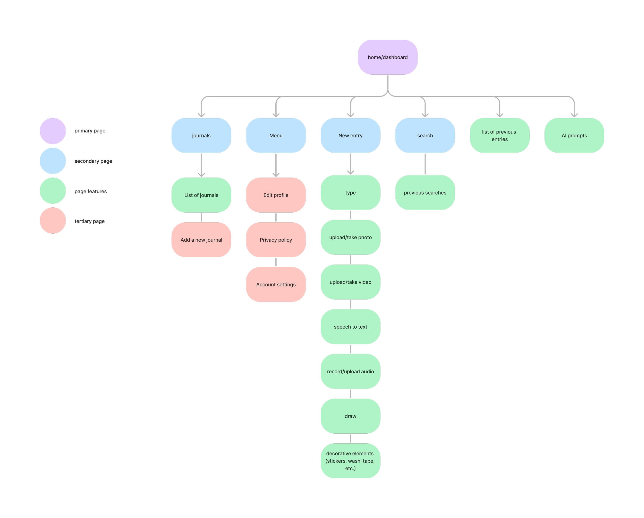
Sitemap
I developed a sitemap to define where the features would be located in the app, and ensure that the app is intuitive and easy to navigate.
User Flows
I decided to focus on three tasks to highlight the key features of the app.
Creating an account
Creating a journal entry using a photo and a voice note
Using a prompt to create a journal entry
Prototype
Low-Fidelity Wireframing
I created some sketches to plan the structure and function of the app. I came up with a few options for designs, and chose the ones that were the most user-friendly and intuitive.
Mid-Fidelity Wireframing
I digitized my ideas, ensuring that my designs were precise and would serve my target users best.
Branding
I spent some time thinking about the tone, feel, and presentation of the app. When journaling, my users valued:
simplicity
joy
freedom
serenity
creativity
The word “muse” means “to consider something thoughtfully”, which is how I want users to approach the app; as a means of sifting through their thoughts and an outlet to express their inner “musings”.
The word also means “inspiration”, which is the goal of the personalized prompts.
Name: Muse
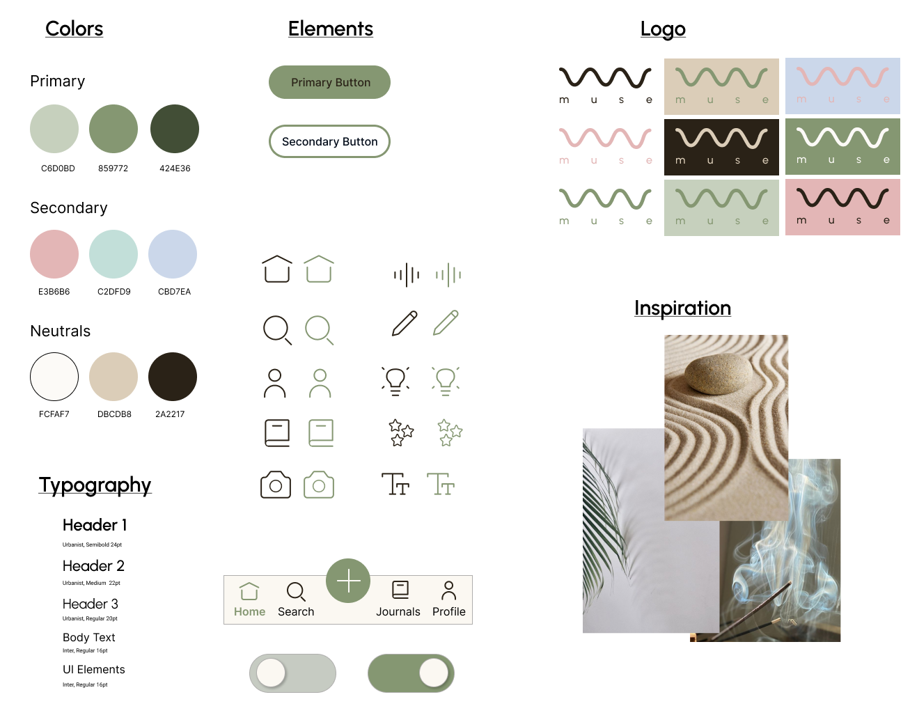
I wanted typography that was clean, simple, and easy to read. I felt that Urbanist and Inter were the best choices.
Typography
Colors, Fonts, Logo
I struggled a bit with the color palette, icons, and the design of the logo.
VERSION 1: Not quite…
After receiving feedback, I realized there was a few issues.
The colors chosen were quite heavy and strong, which opposes the light and calming feel I was initially going for.
The icons were also heavy, with a bold stroke weight, feeling even heavier when filled in.
The strokes of the logo were too thin and busy, and would not scale well when reduced in size.
I went back to the drawing board, pulling colors from my initial moodboard, sourcing icons that felt more light and airy, and drawing inspiration from the curved lines in the images to come up with a more simple and elegant logo.
VERSION 2: Much better!
This was my new branding tile, which felt much more in line with the vision of the app.
The calming sage green as the primary color felt more light and inviting, and the secondary colors were lighter and more serene.
The icons had a lighter stroke weight, and were more minimal in detail.
The logo was much more simple and elegant.
LOGO DESIGN
The simple wavy line resembles waves, which can evoke feelings of calmness from being at a beach or feeling a soft breeze.
The curves of the wave also look like it could have been drawn during a journaling session, representing creative freedom.
The wave is also a lowercase cursive M, for Muse.
High-Fidelity Wireframing
I applied the branding elements to my wireframes, bringing it to life. I obtained feedback from my mentor and made iterations as needed. I used Figma Prototype to create a listening animation for the voice note feature.
Test
User Testing
I conducted 5 moderated user tests, both virtually via Google Meet and in person. I asked users to complete the tasks, explain their thoughts and decisions, and give feedback on the app design.
Tasks
Create an account by completing the onboarding experience.
Create a journal entry with a photo and a voice note
Create a journal entry using a prompt
Success/failure to complete the task
Level of difficulty when completing the task
Total time required to complete the task
Metrics
Overall, users found the app to be pleasant, easy to use, and intuitive. There was very positive feedback on color palette, use of illustrations during onboarding, and the simplicity of the UI.
There were some minor issues with the camera icon, accessing the prompts, and onboarding options, which I was able to address below.
Results
Iterations
I was able to make iterations that would address the majority of the comments brought up by users.
3/5 users mentioned that they would have liked to have a means of accessing the prompts section through the home page, in addition to being able to access it through the “New Journal Entry” page.
Added the lightbulb icon next to the journal title on the home page, to allow for immediate access to the prompt options
Changed the design of the Prompts tiles to have a white background to increase readability.
2 users mentioned that the Camera icon led them to assume that they could only take a photo, rather than having the option to capture a photo or upload from their device.
1 user mentioned that the location of the Prompts icon on the toolbar was too far to the right, which made the Prompts feel like less of a key feature than the other tools.
Added a small image icon in addition to the camera, that will indicate the option of capturing a photo or uploading one.
Moved the prompts icon location closer to the middle to be more noticeable to users.
1 user mentioned that they would have expected to see a “none of the above” option when being offered options for prompts during the onboarding process.
Added a “none of the above” option - which can be changed in the user’s settings.
Final Product
Final Thoughts
This was my first time designing an app from beginning to end, and I had a blast! This app is a cumulation of all that I’ve learned in UX Design, and has instilled my confidence as a new designer. The research phase was particularly interesting, as I was able to see how users approach journaling. I hope that my app is addictive in a healthy way, adding value and encouraging growth within each person.
TAKEAWAYS
Simplicity is everything - it was important for me to prioritize simplicity over elements that might have been fun, but distracting. It took me a surprising amount of time to create an interface that was both clean and effective, but it paid off.
If you don’t succeed, try again - When I was struggling with branding, I found myself overthinking and choosing elements that ended up straying away from my original vision. After getting feedback, taking a deep breath, and trying again, I was able to find the perfect design. It took time away from designing, and felt like a setback, but it was worth it.
Don’t design just for you - I was planning for a mood tracker to be a key element in my design, but users didn’t value it based on my research. Even though they said they might use it, I had to leave it out of this MVP so that I could create an app that had everything a user needs and wants, rather than prioritizing my own personal agenda.
FUTURE CONSIDERATIONS
Adding a calendar feature as an easy way to access older posts, per user feedback and competitive analysis
Testing a mood tracker feature, to see if this is something that users would find beneficial


